
This article has been archived, as it was published several years ago, so some of its information might now be outdated. For more recent articles, please visit the main article feed.
A guide to the SwiftUI layout system - Part 3
Discover page available: SwiftUIInitially, SwiftUI’s layout system might seem a bit inflexible, as its default suite of concepts and APIs doesn’t give us a lot of pixel-level control, and instead focuses on leveraging a strong set of platform-defined defaults — which in turn enables the system to make many common layout decisions on our behalf.
However, once we look beneath the surface, there’s a ton of different customization options and overrides that we can apply to tweak the SwiftUI layout system and its default set of behaviors. So, in this third and final part of this series of articles, let’s explore some of those customization options, and how they can let us resolve common conflicts and remove sources of ambiguity when defining SwiftUI layouts.
The articles on this site are, for the most part, not tutorials. However, this article was (just like part one and part two) written to enable you to easily code along within a SwiftUI-based iOS app project in Xcode, if you wish to do so. Each code sample will show a complete implementation, with no details omitted, except for the views that were built during the previous parts.

Swift by Sundell is brought to you by the Genius Scan SDK — Add a powerful document scanner to any mobile app, and turn scans into high-quality PDFs with one line of code. Try it today.
Encountering conflicts
Picking up where we left off at the end of part two — after adding both a header and a footer to our event view, let’s now add some actual content to it. Just like previously, we’ll stick to placeholder content within this article, to be able to fully focus on exploring the SwiftUI layout system itself.
Let’s start by creating a new view that’ll let us render a placeholder for an image using a RoundedRectangle shape, that’s placed within a ZStack along with a Text:
struct ImagePlaceholder: View {
    var body: some View {
        ZStack {
            RoundedRectangle(cornerRadius: 10).stroke()
            Text("Image placeholder")
        }
    }
}
Next, let’s add an instance of the above ImagePlaceholder, as well as a description text, to our main ContentView — which will now contain the final set of views that we’ll display as part of our event screen:
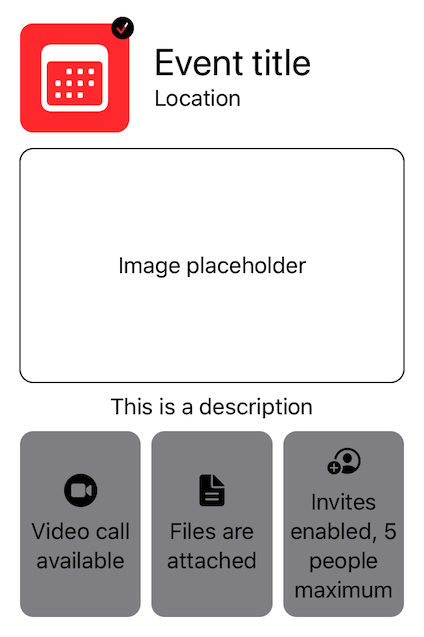
struct ContentView: View {
var body: some View {
VStack {
EventHeader()
ImagePlaceholder()
Text("This is a description")
Spacer()
EventInfoList()
}.padding()
}
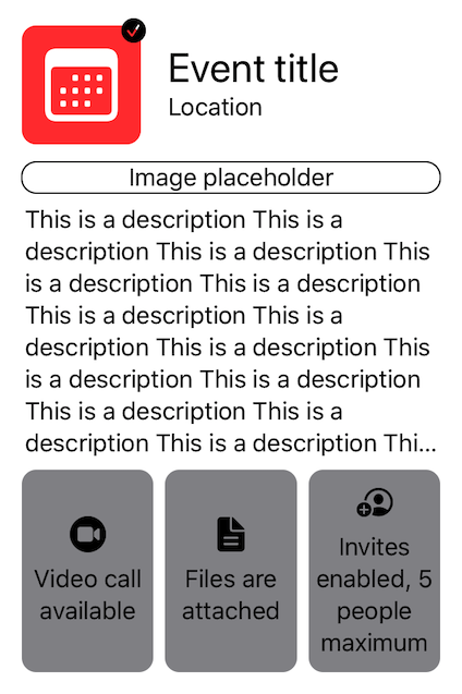
}The result of the above code (which you can show a preview of using the PREVIEW button) shows us one really interesting aspect of SwiftUI’s various shapes — just like spacers, they always occupy as much space as they can. So, given that our description text is currently very short, our image placeholder ends up stretching itself to take up a quite substantial part of the screen.
Now let’s see what would happen if we were to change that by making our description much longer — for example by repeating the same text that we used above 50 times, like this:
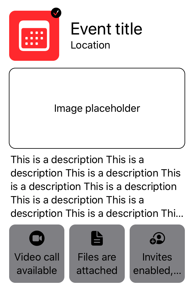
struct ContentView: View {
    var body: some View {
        VStack {
            EventHeader()
            ImagePlaceholder()
            Text(makeDescription())
            Spacer()
            EventInfoList()
        }.padding()
    }
}

private extension ContentView {
    func makeDescription() -> String {
        String(repeating: "This is a description ", count: 50)
    }
}
This is where things are starting to get really interesting. Not only does the SwiftUI layout system truncate our now much longer text, it also truncates the text of our trailing EventInfoBadge at the bottom of the screen — all while still giving a substantial part of the available space to our ImagePlaceholder (which, ironically, is the view that is arguably best suited to be resized in this scenario).
So what’s going on here? It all comes down to how SwiftUI’s fundamental layout rules (which we took a look at in part one) work — in that each view is responsible for determining its own size, and only after that is each parent deciding how to position and fit its children within its own frame.
As a result, since our ImagePlaceholder and our description text are now both requesting frames that are much larger than what could simultaneously fit within our VStack — the layout system is forced to compromise, by first compressing each view as much as possible (which is what causes our EventInfoBadge to get truncated), and then splitting the available space evenly among its children.
Thankfully, SwiftUI ships with a number of tools that we can use to resolve the above sort of layout conflicts — without having to resort to things like manually drawing each of our views ourselves, or by escaping into UIKit or AppKit land.
Layout priorities
Let’s start by taking a look at layout priorities, which enable us to tell the SwiftUI layout system which views that are the most (or least) important in terms of respecting their preferred sizes. Each view starts out with a layout priority of zero, which can then either be reduced or increased by applying the layoutPriority() modifier. Here’s how we could do just that to give our description a slightly higher priority:
struct ContentView: View {
    var body: some View {
        VStack {
            EventHeader()
            ImagePlaceholder()
            Text(makeDescription()).layoutPriority(1)
            Spacer()
            EventInfoList()
        }.padding()
    }
}
Note that there’s no need to go to extremes and use layout priority values like 999 or .infinity — any value larger than zero will have an impact on our layout.
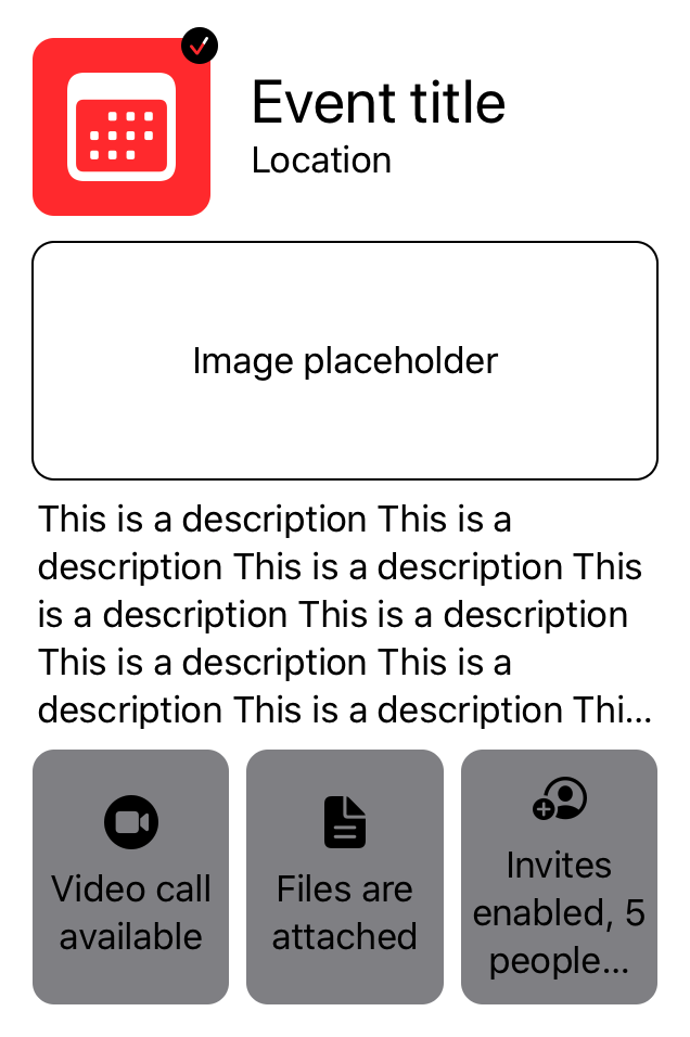
The above tweak definitely makes our view look nicer (again, you can use the PREVIEW button to see what it currently looks like) — with our description now getting a much larger portion of the available space. However, our trailing EventInfoBadge still remains squashed, and our image placeholder now has a much smaller height.
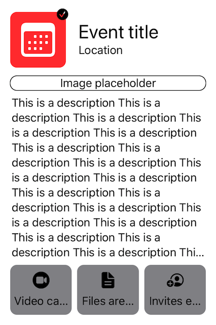
One way to fix that EventInfoBadge problem would be to do the inverse of what we did above, and lower our image placeholder’s layout priority, rather than increasing the one for our description — like this:
struct ContentView: View {
    var body: some View {
        VStack {
            EventHeader()
            ImagePlaceholder().layoutPriority(-1)
            Text(makeDescription())
            Spacer()
            EventInfoList()
        }.padding()
    }
}
That’s once again better, but our image placeholder still gets shrunken down to its absolutely smallest height (equal to the line height of its text), which doesn’t look great. To resolve that issue, let’s also give our placeholder a minimum height using the .frame() modifier:
struct ContentView: View {
var body: some View {
VStack {
EventHeader()
ImagePlaceholder()
.layoutPriority(-1)
.frame(minHeight: 100)
Text(makeDescription())
Spacer()
EventInfoList()
}.padding()
}
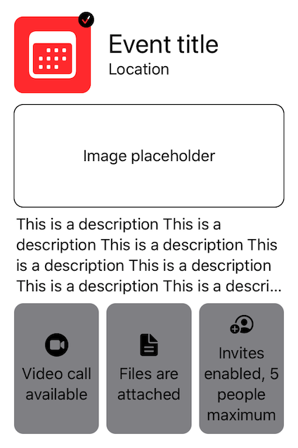
}Our image placeholder now looks great, and so does our description text — however, our EventInfoBadge text once again gets truncated. To solve that final issue, let’s raise the layout priority of our EventInfoList, to tell the layout system to prioritize its height above all else:
struct ContentView: View {
    var body: some View {
        VStack {
            EventHeader()
            ImagePlaceholder()
                .layoutPriority(-1)
                .frame(minHeight: 100)
            Text(makeDescription())
            Spacer()
            EventInfoList().layoutPriority(1)
        }.padding()
    }
}
SwiftUI’s layout priorities system is a simple yet powerful tool that enables us to specify an explicit order in which our views get laid out — which can help us resolve conflicts in terms of how our views get resized to fit within the space that’s available.
Fixed dimensions
One issue with layout priorities, however, is that applying them can occasionally feel like playing a game of “Whack-a-mole” — in that for every tweak and fix that we apply, a new issue pops up. We already saw that starting to happen above, when we had to both raise and lower layout priorities in response to various issues.
So while adjusting a view’s layout priority can be a great way to apply one-off fixes, it’s thankfully not the only tool that lets us tweak SwiftUI’s layout behaviors. Another of those tools is the fixedSize() modifier, which (like the name implies) enables us to fix a view’s size at either its preferred width or height (or both).
Using that modifier, we can achieve the exact same result as in the previous example, only this time without having to introduce additional layout priorities (except the image placeholder one) — by giving our EventInfoList a fixed vertical size, which prevents it from being compressed:
struct ContentView: View {
    var body: some View {
        VStack {
            EventHeader()
            ImagePlaceholder()
                .layoutPriority(-1)
                .frame(minHeight: 100)
            Text(makeDescription())
            Spacer()
            EventInfoList().fixedSize(horizontal: false, vertical: true)
        }.padding()
    }
}
To further illustrate how the fixedSize() modifier works, let’s see what would happen if we were to also give our EventInfoList a fixed horizontal size as well:
struct ContentView: View {
    var body: some View {
        VStack {
            EventHeader()
            ImagePlaceholder()
                .layoutPriority(-1)
                .frame(minHeight: 100)
            Text(makeDescription())
            Spacer()
            EventInfoList().fixedSize(horizontal: true, vertical: true)
        }.padding()
    }
}
As the preview of the above example shows us, fixing our info list’s width causes the entire ContentView to get stretched beyond the bounds of the screen, which might initially seem quite odd.
The reason for that is, since we’re now preventing the layout system from adjusting the width of our EventInfoList, our root VStack will be forced to stretch itself to occupy that same large width (since a stack always resizes itself to fit all of its children within it) — which in turn gives the rest of our subviews more horizontal space, even though that space is partly out of bounds.
Custom alignment guides
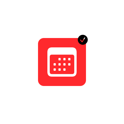
Finally, let’s take a look at using custom alignment guides, and how they can be a great alternative to using other forms of alignment tools — such as padding and offset. For that, we’re going to go back to our verified badge from part one, which — as a quick reminder — we ended up implementing as a View extension using a ZStack and the .offset() modifier:
extension View {
    func addVerifiedBadge(_ isVerified: Bool) -> some View {
        ZStack(alignment: .topTrailing) {
            self

            if isVerified {
                Image(systemName: "checkmark.circle.fill")
                    .offset(x: 3, y: -3)
            }
        }
    }
}
While the above code definitely works, it does make certain assumptions about the size of the badge that we’ll end up displaying — as our offset is currently hard-coded to 3x3 points, irrespective of the size of the image that the system will render.
To address that issue, let’s replace our use of the .offset() modifier with two custom alignment guides. By applying the .alignmentGuide() modifier to a view, we can tweak how it gets positioned when a given horizontal or vertical alignment is used, using a custom computation closure.
Since our ZStack currently uses the .topTrailing alignment, let’s use that set of alignments to tweak our badge’s position, by placing its center according to those two guides — like this:
extension View {
    func addVerifiedBadge(_ isVerified: Bool) -> some View {
        ZStack(alignment: .topTrailing) {
            self

            if isVerified {
                Image(systemName: "checkmark.circle.fill")
                    .alignmentGuide(HorizontalAlignment.trailing) {
                        $0[HorizontalAlignment.center]
                    }
                    .alignmentGuide(VerticalAlignment.top) {
                        $0[VerticalAlignment.center]
                    }
            }
        }
    }
}
The result of the above looks fine, but not as nice as our view previously looked when it was using a hard-coded set of metrics. Essentially, we want to slightly offset our badge image towards the center of the calendar icon itself, to make it feel more attached to its host view.
To make that happen in a way that doesn’t involve any fixed offset values, let’s perform our alignment using a percentage of our badge image’s width and height, rather than using its center. That’s quite easily done, since the ViewDimensions context that is passed into each custom alignment guide’s closure also contains the width and height of the view that is being aligned:
extension View {
    func addVerifiedBadge(_ isVerified: Bool) -> some View {
        ZStack(alignment: .topTrailing) {
            self

            if isVerified {
                Image(systemName: "checkmark.circle.fill")
                    .alignmentGuide(HorizontalAlignment.trailing) {
                        $0.width * 0.8
                    }
                    .alignmentGuide(VerticalAlignment.top) {
                        // Here we first align our view's bottom edge
                        // according to its host view's top edge,
                        // and we then subtract 80% of its height.
                        $0[.bottom] - $0.height * 0.8
                    }
            }
        }
    }
}
One small difference between this approach and our previous offset-based one is that the badge will now be included when computing its host view’s overall frame, which doesn’t make much of a difference in this case, and can be avoided by giving the badge a negative layout priority.
While custom alignment guides are really powerful, they’re quite “heavy” in terms of syntax — so rather than keeping the above modifiers inline, let’s move them to a new View extension that can be applied to any view that we wish to align as a badge:
extension View {
    func alignAsBadge(withRatio ratio: CGFloat = 0.8,
                      alignment: Alignment = .topTrailing) -> some View {
        alignmentGuide(alignment.horizontal) {
            $0.width * ratio
        }
        .alignmentGuide(alignment.vertical) {
            $0[.bottom] - $0.height * ratio
        }
    }
}
With the above extension in place, we can now heavily simplify our verified badge implementation to instead look like this:
extension View {
    func addVerifiedBadge(_ isVerified: Bool) -> some View {
        ZStack(alignment: .topTrailing) {
            self

            if isVerified {
                Image(systemName: "checkmark.circle.fill")
                    .alignAsBadge()
            }
        }
    }
}
So the .alignmentGuide() modifier enables us to override and adjust how a view gets aligned given either a horizontal or vertical alignment — which can be really useful when either building completely custom layouts, or when tweaking how a single view gets positioned. There’s also an API that enables us to define completely custom alignments (by implementing an AlignmentID), which we might take a closer look at in a future article.
Swift by Sundell is brought to you by the Genius Scan SDK — Add a powerful document scanner to any mobile app, and turn scans into high-quality PDFs with one line of code. Try it today.
Conclusion
We’ve now reached the end of this three-part guide to the SwiftUI layout system. I hope that you enjoyed it, and that it has given you new insights into how the SwiftUI layout system works, and the various APIs and tools that can be used to customize its behaviors.
While my goal was definitely to make this guide as thorough as possible, there are of course many different aspects of the SwiftUI layout system that it didn’t cover — so I’m sure that we’ll revisit this topic again, perhaps sooner rather than later.
But for now, let’s again recap what was covered in this third and final part of this series:
- Adjusting layout priorities can be a great way to tweak how each view gets prioritized in terms of its preferred size.
- Applying a fixed frame size to a view prevents it from being resized either horizontally or vertically (or both).
- Custom alignment guides let us adjust how a view gets positioned when a given alignment is used, which can be really useful when we want to position one view in relation to another.
Although I’ve written hundreds of articles for this site, this was the first code-along guide that I’ve ever made, so I’d love to hear your feedback on it — either via Twitter or email. You’re also more than welcome to ask me any questions that you might have, and if you enjoyed this series, feel free to share it with others — I’d really appreciate that.
You can also find a ton of other freely available SwiftUI content on this category page. Next Sunday, we’ll explore a brand new topic — which won’t be related to SwiftUI, I promise.
Thanks for reading! 🚀