This article has been archived, as it was published several years ago, so some of its information might now be outdated. For more recent articles, please visit the main article feed.
A guide to the SwiftUI layout system - Part 1
Discover page available: SwiftUIAlong with its declarative DSL and powerful data bindings, SwiftUI also features a brand new layout system, which in many ways combines the explicitness of manual frame calculations with the adaptiveness of Auto Layout. The result is a system that may appear simple at first glance, but that offers a huge amount of flexibility and power once we start combining its various building blocks into increasingly sophisticated layouts.
This week, let’s explore the SwiftUI layout system by starting to build a full-screen view from scratch. Along the way, we’ll use many different kinds of layout techniques and APIs — which together will demonstrate what the underlying rules of the SwiftUI layout system are, and how each of those rules relate to each other.
The articles on this site are, for the most part, not tutorials. However, this article was written to enable you to easily code along within a new SwiftUI-based iOS app project in Xcode, if you wish to do so. Each code sample will show a complete implementation, with no details omitted.

Swift by Sundell is brought to you by the Genius Scan SDK — Add a powerful document scanner to any mobile app, and turn scans into high-quality PDFs with one line of code. Try it today.
Setting a view’s frame
Let’s get started with a simple ContentView that renders a calendar image as its body, by referencing one of Apple’s built-in SF Symbols:
struct ContentView: View {
    var body: some View {
        Image(systemName: "calendar")
    }
}
By default, SwiftUI lets each view pick its own size based on the container that it’s rendered in, and will then center it within its parent. So the result of the above code is a small icon rendered at the center of the screen — not at the top-left or bottom-left as we might’ve expected based on how UIKit and AppKit work.
Next, let’s make our icon a bit larger, let’s say 50x50 points. An initial idea on how to achieve that might be to use the .frame() view modifier to tell our view to adopt that size, like this:
struct ContentView: View {
    var body: some View {
        Image(systemName: "calendar")
            .frame(width: 50, height: 50)
    }
}
However, while the above code will result in a view that’s 50x50 points, the size of our icon will remain exactly the same as it was before — which might at first seem a bit strange. To explore the reason why that is, let’s give our view a background color so that we can easily see its on-screen frame:
struct ContentView: View {
    var body: some View {
        Image(systemName: "calendar")
            .frame(width: 50, height: 50)
            .background(Color.red)
    }
}
With the above in place, we can see that our view is indeed the right size — it’s just that our icon seems to be completely unaffected by our .frame() modifier, which is actually true. When applying a modifier to a view, we’re often not modifying the view at all, but rather encapsulating it in a new, transparent view. So when calling .background() above, we’re actually applying that background modifier to a new view that wraps our image, rather than to the image itself.
So, from a layout perspective, our image remains exactly the same — it’s still centered within its parent — only this time its parent is a new 50x50 transparent wrapper view instead of the main hosting view, but the rendered result is still the same.
Since SwiftUI views are responsible for determining their own size, we need to tell our image to resize itself to occupy all available space, rather than sticking to its default size. To make that happen, we simply have to apply the .resizable() modifier to it — like this:
struct ContentView: View {
    var body: some View {
        Image(systemName: "calendar")
            .resizable()
            .frame(width: 50, height: 50)
            .background(Color.red)
    }
}
We now have a 50x50 calendar icon rendered at the center of the screen — perfect!
Applying padding
Next, let’s take a look at how padding works in SwiftUI. Just like in other layout systems, like CSS, padding enables us to offset the contents of a view within its own frame. However, depending on where in our chain of view modifiers we apply our padding, we can get quite different results. For example, let’s start by applying a default set of padding by appending the .padding() modifier at the end of our chain:
struct ContentView: View {
    var body: some View {
        Image(systemName: "calendar")
            .resizable()
            .frame(width: 50, height: 50)
            .background(Color.red)
            .padding()
    }
}
Again, the result of the above might not be what we were expecting, as we’ve essentially given our calendar icon outer padding — additional whitespace that doesn’t include its background color. If we think about it, this is the exact same behavior as we encountered before when applying our .frame() modifier — calling .padding() doesn’t actually mutate our earlier views and modifiers, it simply adds whitespace around the result of the preceding expressions.
In fact, if we add a second .background() modifier after the call to .padding(), this behavior becomes a lot more clear — as the second background color will be rendered within the padding itself:
struct ContentView: View {
    var body: some View {
        Image(systemName: "calendar")
            .resizable()
            .frame(width: 50, height: 50)
            .background(Color.red)
            .padding()
            .background(Color.blue)
    }
}
So if we’re looking to add inner padding that takes a view’s background into account, we need to apply that padding before adding the background — like this:
struct ContentView: View {
    var body: some View {
        Image(systemName: "calendar")
            .resizable()
            .frame(width: 50, height: 50)
            .padding()
            .background(Color.red)
    }
}
To further illustrate that each modifier essentially wraps the view that it’s called on within yet another view — if we were to instead call .padding() before applying our .frame() modifier, our icon would shrink, since that padding would be applied within our fixed 50x50 container — forcing our resizable image to adopt a smaller size:
struct ContentView: View {
    var body: some View {
        Image(systemName: "calendar")
            .resizable()
            .padding()
            .frame(width: 50, height: 50)
            .background(Color.red)
    }
}
To finish our calendar icon view, let’s also a apply a bit of corner radius to it and make its foreground color white — and finally extract all of that code into a new view called CalendarView, like this:
struct CalendarView: View {
    var body: some View {
        Image(systemName: "calendar")
            .resizable()
            .frame(width: 50, height: 50)
            .padding()
            .background(Color.red)
            .cornerRadius(10)
            .foregroundColor(.white)
    }
}
In general, whenever we’ve finished defining a UI piece that could act as its own self-contained building block, it’s often a good idea to extract that code into a new View implementation — in order to avoid building massive views.
Stacks and spacers
Like we took a look at in the third episode of Swift Clips, SwiftUI’s various stacks and spacers may at first seem quite simple and limited, but can actually be used to express a nearly infinite combination of layouts. To get started exploring how they work, let’s replace the body of our ContentView with our new CalendarView wrapped within a vertical stack:
struct ContentView: View {
    var body: some View {
        VStack {
            CalendarView()
        }
    }
}
What’s interesting is that the above VStack doesn’t actually affect our layout at all, since SwiftUI stacks don’t stretch themselves to occupy their parent — instead they simply resize themselves according to the total size of their children, which in this case is just our CalendarView from before.
To actually move our CalendarView, we also have to add a Spacer to our stack. When placed within an HStack or VStack, spacers always occupy as much space that they can, which in this case will cause our CalendarView to be pushed to the top of the screen:
struct ContentView: View {
    var body: some View {
        VStack {
            CalendarView()
            Spacer()
        }
    }
}
The cool thing about stacks is that they can be nested in order to express increasingly complex layouts without any form of manual frame calculations. For example, here’s how we could push our CalendarView to the top-leading corner of the screen, by nesting our above VStack within an HStack that also contains a Spacer (we’ll also apply some outer padding to our view hierarchy as well, to inset our content a bit):
struct ContentView: View {
    var body: some View {
        HStack {
            VStack {
                CalendarView()
                Spacer()
            }
            Spacer()
        }.padding()
    }
}
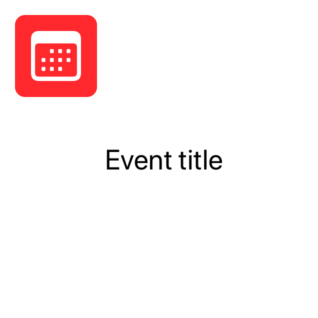
Next, let’s add a Text to our view, in order to start turning it into a screen that can be used to view a set of details about a calendar event. Since we’ll stick to only exploring SwiftUI’s layout system within this article, we’ll hard-code the content of our Text for now:
struct ContentView: View {
    var body: some View {
        HStack {
            VStack {
                CalendarView()
                Spacer()
            }
            Text("Event title").font(.title)
            Spacer()
        }.padding()
    }
}
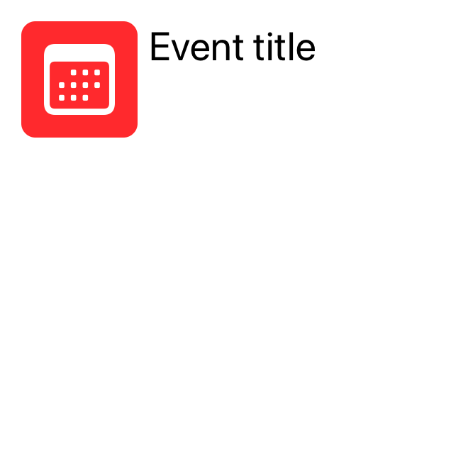
Looking at the above code, we might expect our new Text to be rendered right next to our CalendarView — and while that’s true on the horizontal axis, on the vertical axis it gets centered according to the full height of the screen. The reason for that is that our Spacer only affects the VStack in which our CalendarView is placed, so in order to get the same layout behavior for our Text as well, we’d either have to also wrap it within a VStack containing a spacer — or we can simply tell our root HStack to align all of its children towards the top, like this:
struct ContentView: View {
    var body: some View {
        HStack(alignment: .top) {
            VStack {
                CalendarView()
                Spacer()
            }
            Text("Event title").font(.title)
            Spacer()
        }.padding()
    }
}
Similarly, we can also adjust how a VStack positions its children horizontally, for example in order to render a Text showing the location of our imagined calendar event below the event’s title — while keeping both of those labels aligned according to the leading edge of our root view:
struct ContentView: View {
    var body: some View {
        HStack(alignment: .top) {
            VStack {
                CalendarView()
                Spacer()
            }
            VStack(alignment: .leading) {
                Text("Event title").font(.title)
                Text("Location")
            }
            Spacer()
        }.padding()
    }
}
However, while the above layout works, it could arguably be simplified in order to be easier to mentally visualize. It’s not very intuitive that all of our view’s content is being pushed to the top by a Spacer that’s nested within two stacks, and in order to keep iterating on our view vertically, we would also ideally like our root stack to be a VStack.
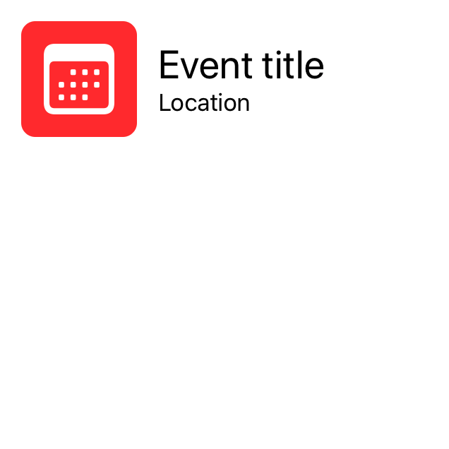
So let’s again extract the body of our ContentView into a dedicated component while refactoring it. This time, let’s call our new view EventHeader, and make it a vertically centered HStack that adds a bit of spacing between its children — which’ll let us achieve an improved version of our earlier layout, all while simplifying our code as well:
struct EventHeader: View {
    var body: some View {
        HStack(spacing: 15) {
            CalendarView()
            VStack(alignment: .leading) {
                Text("Event title").font(.title)
                Text("Location")
            }
            Spacer()
        }
    }
}
Going back to our ContentView, we can now turn its body into a single VStack containing our new EventHeader component, as well as our vertical spacer from before — which is now placed in a much better location in terms of making our layout code easier to understand:
struct ContentView: View {
    var body: some View {
        VStack {
            EventHeader()
            Spacer()
        }.padding()
    }
}
Again, we’re following the same principle of continuously extracting the body of our ContentView into dedicated components whenever possible. Working that way can often enable us to naturally separate our UI into atomic parts, without requiring us to do a ton of architectural design work up-front.
ZStacks and offset
Finally, let’s take a quicker look at SwiftUI’s ZStack type, which enables us to stack a series of views in terms of depth, using a back-to-front order.
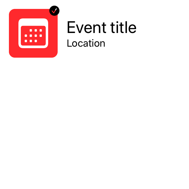
As an example, let’s say that we wanted to add support for displaying a small “verified badge” on top of our calendar view from before — by placing a checkmark icon at its top-trailing corner. To implement that in a slightly more generic way, let’s extend View with an API that lets us wrap any view within a ZStack (which in of itself won’t affect the view’s layout), that’ll also optionally contain our checkmark icon — like this:
extension View {
    func addVerifiedBadge(_ isVerified: Bool) -> some View {
        ZStack(alignment: .topTrailing) {
            self

            if isVerified {
                Image(systemName: "checkmark.circle.fill")
                    .offset(x: 3, y: -3)
            }
        }
    }
}
Note how a ZStack gives us full two-dimensional control over its alignment, which we can use to position our icon in the parent view’s top-trailing corner. We then also apply the .offset() modifier to our badge, which’ll move it slightly outside of the bounds of its parent view.
With the above in place, we can now conditionally add our new badge to our CalendarView in case an eventIsVerified property was set to true (which we’ll currently default to, for simplicity):
struct CalendarView: View {
    var eventIsVerified = true

    var body: some View {
        Image(systemName: "calendar")
            .resizable()
            .frame(width: 50, height: 50)
            .padding()
            .background(Color.red)
            .cornerRadius(10)
            .foregroundColor(.white)
            .addVerifiedBadge(eventIsVerified)
    }
}
Using a ZStack along with the .offset() modifier can be a great way to add various kinds of overlays to a view, without impacting that view’s own layout at all. We can use that technique to implement loading spinners, in-app notifications, and many other kinds of views that we wish to render on top of an existing view hierarchy.

Swift by Sundell is brought to you by the Genius Scan SDK — Add a powerful document scanner to any mobile app, and turn scans into high-quality PDFs with one line of code. Try it today.
Conclusion
That concludes part one of this guide to the SwiftUI layout system. In part two, we’ll continue by taking a look at slightly more powerful ways to build completely custom layouts, but for now — let’s summarize what we’ve covered so far:
- SwiftUI’s core layout engine works by asking each child view to determine its own size based on the bounds of its parent, and then asks each parent to position its children within its own bounds.
- View modifiers often wrap the current view within yet another view, which is why we can get completely different layout results depending on which order that we call our modifiers in.
- Using the
.frame()and.padding()modifiers lets us adjust a view’s size and internal margin, as long as that view is configured to resize itself accordingly. - Using
HStack,VStackandZStackwe can stack views together either horizontally, vertically, or depth-wise. - Using
offset()we can move a view without affecting its surroundings, which is very useful when implementing overlays and other kinds of overlapping views.
I hope you enjoyed this first part. If you did, feel free to share this article with a friend or on social media (that really helps support my work). Also, let me know if you have any questions, comments or feedback — either via Twitter or email.
You can find part two of this article series here.
Thanks for reading! 🚀


