
This article has been archived, as it was published several years ago, so some of its information might now be outdated. For more recent articles, please visit the main article feed.
A guide to the SwiftUI layout system - Part 2
Discover page available: SwiftUILet’s pick up where we left off last week, and continue to explore the SwiftUI layout system and how its various APIs and concepts work. This week, we’ll take a look at a couple of more advanced techniques — such as how we can align views with dynamic dimensions and how to read a view’s surrounding geometry in order to build completely custom layouts.
The articles on this site are, for the most part, not tutorials. However, this article was (just like part one) written to enable you to easily code along within a SwiftUI-based iOS app project in Xcode, if you wish to do so. Each code sample will show a complete implementation, with no details omitted, except for the views that were built during part one.

Swift by Sundell is brought to you by the Genius Scan SDK — Add a powerful document scanner to any mobile app, and turn scans into high-quality PDFs with one line of code. Try it today.
Handling dynamic content
While certain parts of an app’s UI might be relatively static and predictable in terms of their content, chances are high that the majority of the views that we’ll display within any given app are going to be highly dynamic.
Not only do we often have to account for content that’s not known at compile-time (for example text and images downloaded from a server), we also have to make sure that our views scale well according to localized strings and other resources that might differ depending on the environment that our app is run in.
Thankfully, SwiftUI was designed around the fact that most modern apps are indeed very dynamic — and will automatically adapt the views that we declare according to their content, their environment (taking things like the current device size and color scheme into account), and other factors. However, sometimes we might need to make a few tweaks and adjustments to enable SwiftUI to scale and position our views exactly the way we want.
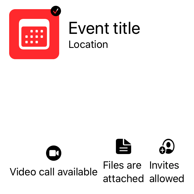
As an example, let’s continue working on our event view from last week, by adding a row of “info badges” at the bottom of the screen — which will display certain information about the current event to the user. To get started, we’ll write a simple EventInfoBadge view using some of the layout techniques that were covered in part one — such as using a VStack to group two views vertically, as well as rendering a system icon with a fixed size:
struct EventInfoBadge: View {
    var iconName: String
    var text: String

    var body: some View {
        VStack {
            Image(systemName: iconName)
                .resizable()
                .frame(width: 25, height: 25)
            Text(text)
        }
    }
}
In isolation, the above implementation looks perfectly fine. However, if we now try to render a horizontal row consisting of three EventInfoBadge instances at the bottom of our ContentView, things won’t look as nice as we might’ve expected:
struct ContentView: View {
    var body: some View {
        VStack {
            EventHeader()
            Spacer()
            HStack {
                EventInfoBadge(
                    iconName: "video.circle.fill",
                    text: "Video call available"
                )
                EventInfoBadge(
                    iconName: "doc.text.fill",
                    text: "Files are attached"
                )
                EventInfoBadge(
                    iconName: "person.crop.circle.badge.plus",
                    text: "Invites allowed"
                )
            }
        }.padding()
    }
}
We’re again hard-coding all of our view’s strings and images, since this article is entirely focused on the SwiftUI layout system, and won’t cover data binding.
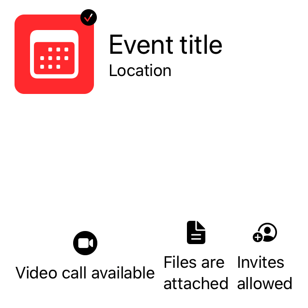
We have two main problems (which you can see by using the Preview button above) — first, our icons are scaled using an incorrect aspect ratio, making them look stretched. Second, since each of our info badges are rendering different strings, they’ll end up getting different widths — which makes our UI look quite uneven.
Let’s first fix our icon stretching problem by applying the .aspectRatio() modifier to our Image — telling it to fit its content into its bounds when resized, like this:
struct EventInfoBadge: View {
var iconName: String
var text: String
var body: some View {
VStack {
Image(systemName: iconName)
.resizable()
.aspectRatio(contentMode: .fit)
.frame(width: 25, height: 25)
Text(text)
}
}
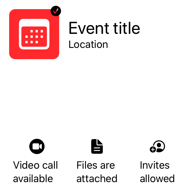
}Next, to make our three info badges occupy the same amount of horizontal space within our ContentView, we need to make each badge take up as much space as it possibly can within its container. That’ll force the parent view (our bottom HStack in this case) to evenly divide the available space among each of its children, rather than giving the most space to the child with the longest text.
To make that happen, let’s give the Text within our EventInfoBadge an infinite max width — which will make the layout system scale it as much as possible on the horizontal axis before splitting it up into multiple lines:
struct EventInfoBadge: View {
    var iconName: String
    var text: String

    var body: some View {
        VStack {
            Image(systemName: iconName)
                .resizable()
                .aspectRatio(contentMode: .fit)
                .frame(width: 25, height: 25)
            Text(text)
                .frame(maxWidth: .infinity)
        }
    }
}
With the above two fixes in place, our view now looks a lot nicer — so let’s wrap our EventInfoBadge implementation up by center-aligning its text and by giving it some padding, a background color, and rounded corners:
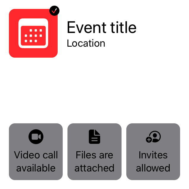
struct EventInfoBadge: View {
    var iconName: String
    var text: String

    var body: some View {
        VStack {
            Image(systemName: iconName)
                .resizable()
                .aspectRatio(contentMode: .fit)
                .frame(width: 25, height: 25)
            Text(text)
                .frame(maxWidth: .infinity)
                .multilineTextAlignment(.center)
        }
        .padding(.vertical, 10)
        .padding(.horizontal, 5)
        .background(Color.secondary)
        .cornerRadius(10)
    }
}
Finally, let’s again follow the same practice as we did during part one, and move our list of info badges out from our ContentView and into a new stand-alone component — to prevent our content view from becoming massive:
struct EventInfoList: View {
    var body: some View {
        HStack {
            EventInfoBadge(
                iconName: "video.circle.fill",
                text: "Video call available"
            )
            EventInfoBadge(
                iconName: "doc.text.fill",
                text: "Files are attached"
            )
            EventInfoBadge(
                iconName: "person.crop.circle.badge.plus",
                text: "Invites enabled"
            )
        }
    }
}
Rather than creating the above HStack inline within our ContentView, we can now simply initialize an instance of EventInfoList and we’re good to go:
struct ContentView: View {
    var body: some View {
        VStack {
            EventHeader()
            Spacer()
            EventInfoList()
        }.padding()
    }
}
Plus, if we ever want to render the same type of list elsewhere within our app, we’ll now be able to easily do that.
Geometry, preferences, and layout dependencies
However, it turns out that our EventInfoBadge still has one remaining issue. While our current implementation handles dynamic text lengths in terms of width, we still have to address the fact that our badges might end up with different heights — for example if we make one of our texts slightly longer:
struct EventInfoList: View {
var body: some View {
HStack {
EventInfoBadge(
iconName: "video.circle.fill",
text: "Video call available"
)
EventInfoBadge(
iconName: "doc.text.fill",
text: "Files are attached"
)
EventInfoBadge(
iconName: "person.crop.circle.badge.plus",
text: "Invites enabled, 5 people maximum"
)
}
}
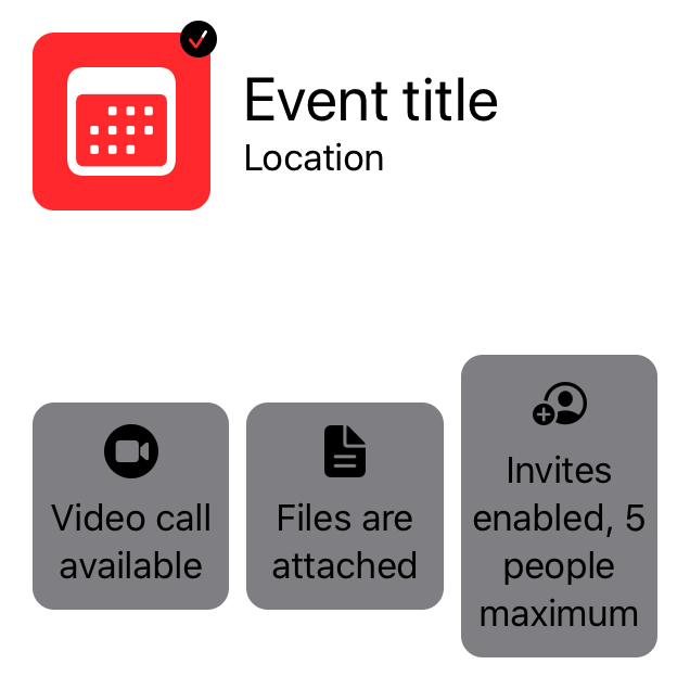
}The above result might not be a deal-breaker, but our UI would arguably look a lot nicer if we instead were able to give each of our badges the exact same height. To make that happen, we’ll have to come up with a way to notify our EventInfoList of the maximum height among its children, so that it then can resize the remaining child views to also occupy that same vertical space.
Since this is a piece of functionality that we’ll likely want to reuse in different parts of our app (or even between projects), let’s implement it as a new stand-alone view called HeightSyncedRow. We’ll start by using the @ViewBuilder function builder attribute to enable our new view to be used with the same DSL-like syntax that SwiftUI’s built-in containers and stacks are using. We’ll then assign a childHeight to the result of that DSL expression, like this:
struct HeightSyncedRow<Content: View>: View {
    private let content: Content
    @State private var childHeight: CGFloat?

    init(@ViewBuilder content: () -> Content) {
        self.content = content()
    }

    var body: some View {
        HStack {
            content.frame(height: childHeight)
        }
    }
}
The great thing about using the same @ViewBuilder attribute as SwiftUI’s built-in views is that we can now go back to our EventInfoList and simply replace its HStack with our new HeightSyncedRow — without having to make any additional changes:
struct EventInfoList: View {
    var body: some View {
        HeightSyncedRow {
            EventInfoBadge(
                iconName: "video.circle.fill",
                text: "Video call available"
            )
            EventInfoBadge(
                iconName: "doc.text.fill",
                text: "Files are attached"
            )
            EventInfoBadge(
                iconName: "person.crop.circle.badge.plus",
                text: "Invites enabled, 5 people maximum"
            )
        }
    }
}
Next, let’s compute the childHeight value that our HeightSyncedRow will assign to each of its children. To do that, we’re going to make each child report its current height upwards through the view hierarchy, by using SwiftUI’s Preferences system — that enables us to associate a given value with a preference key within a child view, which can then later be read within one of its parents.
Doing so first requires us to implement a PreferenceKey, which both includes the preference’s defaultValue, as well as a method for reducing two values (the previous and next) into one — like this:
private struct HeightPreferenceKey: PreferenceKey {
    static let defaultValue: CGFloat = 0

    static func reduce(value: inout CGFloat,
                       nextValue: () -> CGFloat) {
        value = nextValue()
    }
}
Next, we’re going to use SwiftUI’s GeometryReader type — which is a view that, among other things, enables us to read the size of the current view’s container. By embedding a GeometryReader as a given view’s background, we can perform that sort of reading without affecting that view’s layout in any way — as a background view will always just occupy the same frame as the view that it’s attached to.
Finally, we’ll wrap all of that functionality into a View extension that enables us to sync any view’s height into a given Binding property wrapper — which gives us this implementation:
extension View {
    func syncingHeightIfLarger(than height: Binding<CGFloat?>) -> some View {
        background(GeometryReader { proxy in
            // We have to attach our preference assignment to
            // some form of view, so we just use a clear color
            // here to make that view completely transparent:
            Color.clear.preference(
                key: HeightPreferenceKey.self,
                value: proxy.size.height
            )
        })
        .onPreferenceChange(HeightPreferenceKey.self) {
            height.wrappedValue = max(height.wrappedValue ?? 0, $0)
        }
    }
}
With the above in place, we can now go back to our HeightSyncedRow and simply make it apply our new syncingHeightIfLarger modifier to its content view — which in turn will make each of its children adopt the exact same height:
struct HeightSyncedRow<Content: View>: View {
private let content: Content
@State private var childHeight: CGFloat?
init(@ViewBuilder content: () -> Content) {
self.content = content()
}
var body: some View {
HStack {
content.syncingHeightIfLarger(than: $childHeight)
.frame(height: childHeight)
}
}
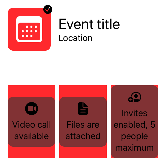
}However, if we now render our main ContentView again, we won’t actually be able to tell that all of our info badges have the same height — since we’re applying the .frame() modifier after we’ve given each of our info badges their background color. To illustrate that problem we can again use the classic “red background color trick”, just like we did in part one:
struct HeightSyncedRow<Content: View>: View {
    private let content: Content
    @State private var childHeight: CGFloat?

    init(@ViewBuilder content: () -> Content) {
        self.content = content()
    }

    var body: some View {
        HStack {
            content.syncingHeightIfLarger(than: $childHeight)
                   .frame(height: childHeight)
                   .background(Color.red)
        }
    }
}
Now, to fix the problem, let’s move our background assignment out from EventInfoBadge and into our HeightSyncedRow instead. That way, we’ll be able to first assign each view’s frame, and then add its background — which will give all of our background views the correct size. To still let HeightSyncedRow remain a reusable component, let’s add support for injecting a Background view as part of its initializer, which we’ll then assign to each child — like this:
struct HeightSyncedRow<Background: View, Content: View>: View {
    private let background: Background
    private let content: Content
    @State private var childHeight: CGFloat?

    init(background: Background,
         @ViewBuilder content: () -> Content) {
        self.background = background
        self.content = content()
    }

    var body: some View {
        HStack {
            content.syncingHeightIfLarger(than: $childHeight)
                   .frame(height: childHeight)
                   .background(background)
        }
    }
}
With the above in place, let’s now go back to EventInfoList and update it to pass the background view from EventInfoBadge when creating its HeightSyncedRow — like this:
struct EventInfoList: View {
    var body: some View {
        HeightSyncedRow(background: Color.secondary.cornerRadius(10)) {
            EventInfoBadge(
                iconName: "video.circle.fill",
                text: "Video call available"
            )
            EventInfoBadge(
                iconName: "doc.text.fill",
                text: "Files are attached"
            )
            EventInfoBadge(
                iconName: "person.crop.circle.badge.plus",
                text: "Invites enabled, 5 people maximum"
            )
        }
    }
}
Now all that remains is to remove the background assignment from our EventInfoBadge and our implementation will be complete:
struct EventInfoBadge: View {
    var iconName: String
    var text: String

    var body: some View {
        VStack {
            Image(systemName: iconName)
                .resizable()
                .aspectRatio(contentMode: .fit)
                .frame(width: 25, height: 25)
            Text(text)
                .frame(maxWidth: .infinity)
                .multilineTextAlignment(.center)
        }
        .padding(.vertical, 10)
        .padding(.horizontal, 5)
    }
}
What we essentially had to deal with during this whole exercise is layout dependencies — when one view’s layout depends on another view somehow. In our case, we couldn’t determine the final frame of each EventInfoBadge before first knowing the maximum height among them.
While layout dependencies should arguably be avoided whenever possible (as they tend to make our views quite tightly coupled), sometimes it’s necessary to establish a chain of communication between a set of child views and their parent — and if we can do that through generic abstractions (such as the HeightSyncedRow that we built), then we can often find a way to manage our layout dependencies in a way that still makes our code modular and easy to change.
Swift by Sundell is brought to you by the Genius Scan SDK — Add a powerful document scanner to any mobile app, and turn scans into high-quality PDFs with one line of code. Try it today.
Conclusion
That concludes part two of this guide to the SwiftUI layout system. Next week, we’ll wrap up this series by taking a look at how we can make our views scale even better across multiple screen sizes, and how to define layout priorities and even more custom layouts. But for now, let’s summarize what we covered in this part:
- The
.aspectRatio()modifier lets us adjust how a view’s content gets scaled as the view is resized. It’s particularly useful for images. - Using
.frame(maxWidth: .infinity)(or its height equivalent) can be a great way to tell a view to occupy as much space as it can within a given dimension — which in turn can be used to “force” its parent to divide all available space evenly among its children. GeometryReaderis a special view that reads its surrounding geometry, and lets us build custom layouts accordingly.- Using SwiftUI’s Preferences system, we can communicate upwards through a view hierarchy, for example in order to notify a parent of a child view’s computed size.
I hope you enjoyed the second part of this series. If you did, feel free to share this article with a friend or on social media (that really helps support my work). Also, let me know if you have any questions, comments or feedback — either via Twitter or email.
You can find the third and final part of this article series here.
Thanks for reading! 🚀