This article has been archived, as it was published several years ago, so some of its information might now be outdated. For more recent articles, please visit the main article feed.
How to sync the width or height of two SwiftUI views?
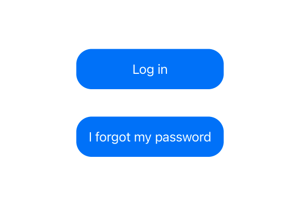
Discover page available: SwiftUIA quite common, yet surprisingly hard problem to solve when building views using SwiftUI is how to make two dynamic views take on the same width or height. For example, here we’re working on a LoginView that has two buttons — one for logging in, and one that triggers a password reset — which are currently implemented like this:
struct LoginView: View {
    ...

    var body: some View {
        VStack {
            ...
            Group {
                Button("Log in") {
                    ...
                }
                Button("I forgot my password") {
                    ...
                }
            }
            .padding()
            .background(Color.blue)
            .foregroundColor(.white)
            .cornerRadius(20)
        }
    }
}
If you use the above PREVIEW button, you can see that our buttons have different widths, which is to be expected, since they’re displaying two different texts that aren’t equally long. But what if we actually wanted them to have the same width (which would arguably look a lot better) — how could that be achieved?
We’ll ignore approaches that involve hardcoding the width of our views (which won’t work for most modern apps that are expected to adapt to things like user accessibility settings and localized strings), or manually measuring the size of each underlying string. Instead, we’ll focus on solutions that are more robust and easier to maintain.
Infinite frames
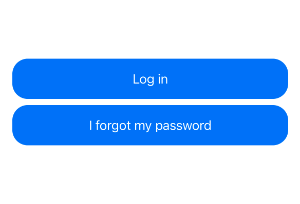
If we’re fine with having our buttons stretch out to fit the width of the container that they’re displayed in, then one potential solution would be to give both buttons an infinite max width. That can be done using the frame modifier, which when combined with some additional horizontal padding could give us a quite nice result (at least when our LoginView will be displayed in a narrow container, such as when running on a portrait-oriented iPhone):
struct LoginView: View {
    ...

    var body: some View {
        VStack {
            ...
            Group {
                Button("Log in") {
                    ...
                }
                Button("I forgot my password") {
                    ...
                }
            }
            .frame(maxWidth: .infinity)
            .padding()
            .background(Color.blue)
            .foregroundColor(.white)
            .cornerRadius(20)
            .padding(.horizontal)
        }
    }
}
Again, feel free to use the above PREVIEW button to see what the rendered result looks like for that implementation.
GeometryReader
While we could always use other, more static maxWidth values in order to prevent our buttons from being stretched out too much, perhaps we’d instead like to dynamically compute that value based on the width of our container. To do that, we could use a GeometryReader, which gives us access to the geometry information for the context in which our buttons will be rendered.
However, a quite substantial downside of using a GeometryReader in this context is that it occupies all of the space that’s available within our UI — meaning that our LoginView could end up becoming much larger than what we’d expect, and we’d also need to make sure that our root VStack ends up stretching all of that available space as well, in order to retain our desired layout.
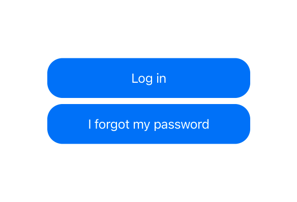
Here’s what such an implementation could look like if we wanted our buttons to not be stretched beyond 60% of the total available width:
struct LoginView: View {
    ...

    var body: some View {
        GeometryReader { geometry in
            VStack {
                ...
                Group {
                    Button("Log in") {
                        ...
                    }
                    Button("I forgot my password") {
                        ...
                    }
                }
                .frame(maxWidth: geometry.size.width * 0.6)
                .padding()
                .background(Color.blue)
                .foregroundColor(.white)
                .cornerRadius(20)
            }
            .frame(maxWidth: .infinity)
        }
    }
}
Another potential downside of the above approach is that we have to make sure to pick a width multiplier that will work for all screen and text size combinations, which can sometimes be quite tricky.
Using a grid
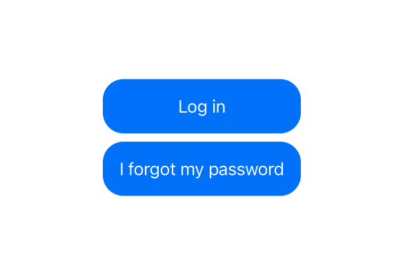
If our app uses iOS 14 or macOS Big Sur as its minimum deployment target, then another potential solution to our width syncing problem would be to use a LazyHGrid. Non-adaptive, horizontal grids automatically sync the width of their cells, which lets us achieve our desired button layout like this:
struct LoginView: View {
    ...

    var body: some View {
        VStack {
            ...
            LazyHGrid(rows: [buttonRow, buttonRow]) {
                Group {
                    Button("Log in") {
                        ...
                    }
                    Button("I forgot my password") {
                        ...
                    }
                }
                .frame(maxWidth: .infinity)
                .padding()
                .background(Color.blue)
                .foregroundColor(.white)
                .cornerRadius(20)
            }
        }
    }

    private var buttonRow: GridItem {
    GridItem(.flexible(minimum: 0, maximum: 80))
}
}
However, note that while the width of our two buttons is now completely dynamic (and fully synced), we have to hard-code the maximum height of each of our grid’s rows, since otherwise our grid would end up taking up all of the available space (just like a GeometryReader). That might not be an issue in certain situations, but it’s still something to be aware of if we end up using the above solution.
Using a preference key
Perhaps the most dynamic and robust solution to the problem of syncing the widths or heights of two dynamic views is to use SwiftUI’s preferences system to measure and then send the size of each button to their parent view. To do that, let’s start by creating a PreferenceKey-conforming type that reduces all transmitted button width values by picking the maximum one — like this:
private extension LoginView {
    struct ButtonWidthPreferenceKey: PreferenceKey {
        static let defaultValue: CGFloat = 0

        static func reduce(value: inout CGFloat,
                           nextValue: () -> CGFloat) {
            value = max(value, nextValue())
        }
    }
}
With the above in place, we could then embed a GeometryReader within the background of each button (which makes it assume the same size as the button itself), and then send and observe our width values using our new preference key. We’d then store the maximum value in a @State-marked property, which will cause our view to be updated when that value was modified. Here’s what such an implementation could look like:
struct LoginView: View {
    ...
    @State private var buttonMaxWidth: CGFloat?

    var body: some View {
        VStack {
            ...
            Group {
                Button("Log in") {
                    ...
                }
                Button("I forgot my password") {
                    ...
                }
            }
            .background(GeometryReader { geometry in
    Color.clear.preference(
        key: ButtonWidthPreferenceKey.self,
        value: geometry.size.width
    )
})
.frame(width: buttonMaxWidth)
            .padding()
            .background(Color.blue)
            .foregroundColor(.white)
            .cornerRadius(20)
        }
        .onPreferenceChange(ButtonWidthPreferenceKey.self) {
    buttonMaxWidth = $0
}
    }
}
Note that we’re using Color.clear (rather than EmptyView) as the return value within our GeometryReader closure. That’s because EmptyView instances are completely ignored by SwiftUI, which would prevent our preferences values from being sent in this case.
While the above solution is definitely much more involved than the ones we explored earlier, it does give us the most dynamic solution (by far), since we’re no longer forced to hard-code any aspects of our layout. Instead, our buttons will now adapt according to their labels, which gives us a solution that works across a wide range of screen sizes, languages, and accessibility settings.
To learn more about the above technique, and many other SwiftUI layout tools, check out my three-part guide to the SwiftUI layout system.
Conclusion
While SwiftUI’s declarative design has many advantages, it does make tasks like the one we explored in this article quite difficult. Neither of the above solutions are really perfect, and things like this could sort of make us wish for an Auto Layout-like constraint-based layout system, which would make it much easier to express that two views should be synced in terms of width or height.
Regardless, I hope that the above techniques will be helpful when you’re building your SwiftUI views, and feel free to reach out via either Twitter or email if you have any questions, comments, or feedback.
Thanks for reading!

Swift by Sundell is brought to you by the Genius Scan SDK — Add a powerful document scanner to any mobile app, and turn scans into high-quality PDFs with one line of code. Try it today.


