
This article has been archived, as it was published several years ago, so some of its information might now be outdated. For more recent articles, please visit the main article feed.
Using SwiftUI’s frame modifier to resize and align views
Discover page available: SwiftUISwiftUI’s built-in frame modifier can both be used to assign a static width or height to a given view, or to apply “constraints-like” bounds within which the view can grow or shrink depending on its contents and surroundings.
At the very basic level, this is what two common usages of the frame modifier could look like:
// A view that displays a 30x30 fixed-sized icon using an SFSymbol:
struct Icon: View {
    var name: String
    var tintColor: Color = .blue

    var body: some View {
        Image(systemName: name)
            .foregroundColor(tintColor)
            .frame(width: 30, height: 30)
    }
}

// A view that displays a decorative image that's resized according
// to its aspect ratio, with a maximum width of 200 points:
struct DecorativeImage: View {
    var name: String

    var body: some View {
        Image(name)
            .resizable()
            .aspectRatio(contentMode: .fit)
            .frame(maxWidth: 200)
    }
}
While the above two ways of using the frame modifier are both incredibly useful, sometimes we might not want to specify any kind of fixed metric when deciding how our views should be sized. Thankfully, there’s also a way to make a given view expand infinitely, which can come in handy in many different kinds of situations.
For example, let’s say that we’re working on a view that displays an array of categories as a two-column grid using SwiftUI’s LazyVGrid type:
struct CategoryGrid: View {
    var categories: [Category]

    var body: some View {
        LazyVGrid(columns: columns) {
            ForEach(categories) { category in
                Text(category.name)
                    .padding()
                    .background(category.color)
                    .foregroundColor(.white)
                    .cornerRadius(10)
            }
        }
        .padding()
    }

    private var columns: [GridItem] {
        let item = GridItem(.flexible(minimum: 50, maximum: .infinity))
        return [item, item]
    }
}
As you can see by using the above PREVIEW button, our grid currently doesn’t look that great, since each cell ends up being a different size based on the text that it’s rendering.
That might initially seem a little bit strange — given that we’re specifying that both of our columns should be flexible with an infinite max width — but since a Text view doesn’t stretch itself to fit its container, each view’s background color will just end up occupying the size of the text itself.
Thankfully, this is another problem that can easily be solved using the frame modifier in combination with the CGFloat.infinity constant that we also used above when creating the GridItem values representing our columns. By inserting such a modifier before rendering our background, we can now make our grid look much nicer:
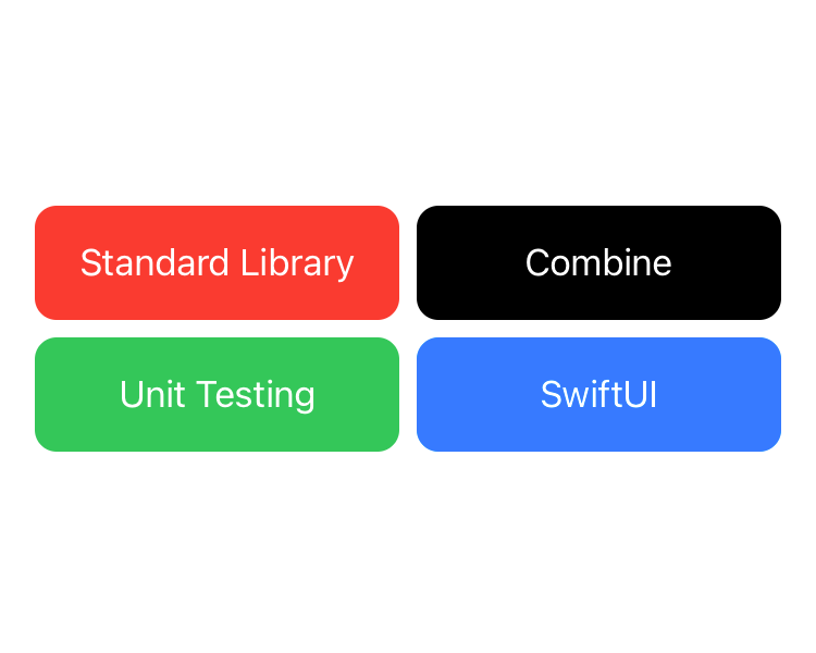
struct CategoryGrid: View {
    var categories: [Category]

    var body: some View {
        LazyVGrid(columns: columns) {
            ForEach(categories) { category in
                Text(category.name)
                    .padding()
                    .frame(maxWidth: .infinity)
                    .background(category.color)
                    .foregroundColor(.white)
                    .cornerRadius(10)
            }
        }
        .padding()
    }

    ...
}
Once again, you can use the PREVIEW button to see what the above code sample looks like when rendered.
So applying the frame modifier with either an infinite max width or max height can be a great way to tell a given SwiftUI view to stretch itself to fill all available space on either the horizontal or vertical axis.
Let’s take a look at another example, in which we’ve built an InfoView that can be used to display a piece of information text along with a title. Our intent is for these info views to always be displayed across the entire width of the screen (minus some padding), which they most likely will on iPhones running in portrait orientation, but in landscape (or on iPads) there might not be enough text to cover the entire width of the screen:

struct InfoView: View {
    var title: String
    var text: String

    var body: some View {
        HStack(alignment: .top, spacing: 15) {
            Image(systemName: "info.circle")
            VStack(alignment: .leading, spacing: 10) {
                Text(title).font(.headline)
                Text(text)
            }
        }
        .padding()
        .foregroundColor(.white)
        .background(Color.blue)
        .cornerRadius(20)
    }
}
One way to fix that problem would be to use a Spacer to fill out the remaining horizontal space — which would effectively make our InfoView always render across the full width of its container. However, while spacers are truly an essential part of SwiftUI’s layout system, in this case, adding a Spacer to our view could actually end up breaking its portrait layout — since spacers always occupy a minimum amount of space by default, and since our HStack applies 15 points of spacing between each of its elements:
struct InfoView: View {
    ...

    var body: some View {
        HStack(alignment: .top, spacing: 15) {
            Image(systemName: "info.circle")
            VStack(alignment: .leading, spacing: 10) {
                Text(title).font(.headline)
                Text(text)
            }
            Spacer()
        }
        ...
    }
}
Like the above PREVIEW shows, because of our added Spacer, our text can no longer be rendered across all of our view’s available width.
This is once again another great use case for the frame modifier, which in this case can sort of act as a spacer if we not only specify infinity as its maxWidth, but also tell it to align its contents according to the leading edge — like this:

struct InfoView: View {
    ...

    var body: some View {
        HStack(alignment: .top, spacing: 15) {
            Image(systemName: "info.circle")
            VStack(alignment: .leading, spacing: 10) {
                Text(title).font(.headline)
                Text(text)
            }
            .frame(maxWidth: .infinity, alignment: .leading)
        }
        ...
    }
}
Note how we need to specify .leading as the alignment for both our VStack and its frame modifier, since the former aligns the stack’s content (or two texts), while the latter aligns the stack itself within its surrounding frame.
Of course, rather than using .infinity as our maxWidth, we could’ve also opted to specify a fixed value in order to prevent our view from stretching too much on larger devices, such as the iPad. But that’s a decision that’ll ultimately come down to what sort of design that we’re going for when implementing each view.

Swift by Sundell is brought to you by the Genius Scan SDK — Add a powerful document scanner to any mobile app, and turn scans into high-quality PDFs with one line of code. Try it today.