
This article has been archived, as it was published several years ago, so some of its information might now be outdated. For more recent articles, please visit the main article feed.
Applying rounded corners to a UIKit or SwiftUI view
Discover page available: SwiftUIRounded rectangles have been a core part of Apple’s overall UI design for many years, so when building apps using frameworks like UIKit or SwiftUI, it’s incredibly common to want to apply some form of corner radius to some of the views that we’ll create. Let’s take a quick look at the main APIs that enable us to do just that.
UIKit and Core Animation
Although UIKit itself doesn’t include any APIs for changing a given view’s corner radius, the fact that each UIView is backed by an underlying CALayer lets us use Core Animation to perform those kinds of tweaks.
As an example, let’s say that we’re building a button that lets the user advance to the next step within a given flow, which is currently configured like this:
let button = UIButton(type: .custom)
button.setTitle("Next", for: .normal)
button.setTitleColor(.white, for: .normal)
button.backgroundColor = .blue
button.contentEdgeInsets = UIEdgeInsets(
    top: 4,
    left: 6,
    bottom: 4,
    right: 6
)
If we then wanted to apply a standard corner radius to each of the above button’s corners, we could do so by modifying the cornerRadius property of its underlying layer:
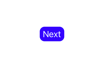
button.layer.cornerRadius = 10💡 Tip: You can use the PREVIEW button to see the result of the above change.
While the above technique will work perfectly fine in many different situations, sometimes we might want to customize things further in order to achieve a specific kind of look.
For example, when applying a somewhat larger amount of corner radius to a given view, using the default settings can result in corners that are perhaps not as smooth as we’d expect. To demonstrate, let’s increase both the font size and the corner radius of our button, and if you use the PREVIEW button below, you can see that our corners now end up having quite a sharp look:

button.titleLabel?.font = .systemFont(ofSize: 80)
button.layer.cornerRadius = 30
Thankfully, that problem is easy to fix. All that we have to do is to instead use the continuous corner curve when rendering our button’s layer, which will give its corners a smoother look:

button.layer.cornerCurve = .continuousAnother customization option that can be really useful is the maskedCorners property, which lets us control which of our button’s four corners that should be rounded. For example, if we’d like to place our button in the bottom-right corner of the screen, then we might want to only round our button’s top-left corner, which can be done like this:

button.layer.maskedCorners = [.layerMinXMinYCorner]Using the above set of properties we can gain quite detailed control over how we’d like a given view’s corners to be rounded, and since Core Animation is what powers all of UIKit (and significant parts of AppKit as well), they’re likely to be useful in many different kinds of situations.
SwiftUI
SwiftUI might not give us direct access to the layers used to render its views, but it does feature a dedicated modifier that lets us apply a given amount of corner radius to any view — which can be used like this:
Button("Next") {
    ...
}
.foregroundColor(.white)
.padding(.horizontal, 4)
.padding(.vertical, 6)
.background(Color.blue)
.cornerRadius(10)
However, the above API doesn’t let us tweak any of the other parameters that Core Animation gives us access to, meaning that we’ll have to switch to a different strategy if we’re looking for more customization options.
For example, one way to use the continuous style to round a view’s corners is to use a RoundedRectangle shape as its background, rather than using a color combined with the cornerRadius modifier:
Button("Next") {
    ...
}
.foregroundColor(.white)
.padding(.horizontal, 4)
.padding(.vertical, 6)
.background(
    RoundedRectangle(
        cornerRadius: 10,
        style: .continuous
    )
    .fill(Color.blue)
)
The above will give us the same result as when we were assigning the .continuous corner curve to our UIKit button’s CALayer.
Unfortunately, SwiftUI doesn’t include any built-in way to only round specific corners, but we could always accomplish that by either implementing a custom Shape, or a UIView that uses the maskedCorners Core Animation API that we took a look at earlier. We could then use either of those implementations as our view’s background (if going the UIKit route, we’d have to wrap that view using UIViewRepresentable first), just like how we used a RoundedRectangle above.

Swift by Sundell is brought to you by the Genius Scan SDK — Add a powerful document scanner to any mobile app, and turn scans into high-quality PDFs with one line of code. Try it today.
Conclusion
I hope that this short article has given you a few ideas on how to render different kinds of rounded corners when using either UIKit or SwiftUI. If you have any questions, comments, or feedback, then feel free to reach out via either Twitter or email.
Thanks for reading!