
This article has been archived, as it was published several years ago, so some of its information might now be outdated. For more recent articles, please visit the main article feed.
Getting the most out of Xcode Previews for SwiftUI
Discover page available: SwiftUIDepending on who you ask, the SwiftUI-powered Previews feature introduced in Xcode 11 either provides a revolutionary new way of building UIs, or falls more towards the gimmick end of the usefulness spectrum.
However, like with most development tools, the amount of utility that Xcode’s previews can provide is to a large extent determined by how they’re used, and whether our code is set up in a way that’s compatible with them. So this week, let’s take a look at a few techniques, patterns, and ways of structuring UI code that can help us get the very most out of that new preview system.

Swift by Sundell is brought to you by the Genius Scan SDK — Add a powerful document scanner to any mobile app, and turn scans into high-quality PDFs with one line of code. Try it today.
Screens, components, and interactivity
Regardless of what framework that’s used to build a given UI, it’s typically useful to separate our various views into two main categories — screens and components. While each of those can then have any number of subcategories, we’re often either working on a given app screen as a whole, or on a (more or less reusable) subset of it.
As an example, let’s say that we’re using SwiftUI to build such a reusable component — in this case a row for rendering a reminder within something like a todo or reminders list:
struct ReminderRow: View {
    var title: String
    var description: String

    var body: some View {
        VStack(alignment: .leading) {
            Text(title)
            Text(description)
                .foregroundColor(.secondary)
                .font(.footnote)
        }
    }
}
Now, as we’re iterating on the above component, we could of course constantly build and run the app, navigate to a screen that its being used on, and verify that everything renders correctly — but that’s boring, repetitive and error prone (which just so happens to be my three main criteria for tasks that should ideally be automated).
This type of automation is exactly what Xcode’s Previews feature is all about — as it lets us set up specific instances of our screens and components that’ll automatically get updated as we iterate on our code.
To create a preview, all that we have to do is to define a type conforming to the PreviewProvider protocol, and place it within the Swift file that we wish the preview to appear alongside of — like this:
#if DEBUG
struct ReminderRowPreview: PreviewProvider {
    static var previews: some View {
        ReminderRow(
            title: "Write weekly article",
            description: "Think it'll be about Xcode Previews"
        )
    }
}
#endif
Note how we encapsulate the above preview using the DEBUG compiler directive. That’s to prevent us from accidentally using that type within our production code, as if we did, the compiler would throw an error once we build our app in release mode. You can assume that all preview-specific code within this article would be surrounded by that compiler directive, even if it won’t be typed out for the sake of brevity.
The cool thing is that Xcode’s preview system uses the same DSL-like API that SwiftUI uses, which gives us a lot of power and flexibility when it comes to how we set up our various previews throughout our code base.
However, the above ReminderRow implementation is currently quite simple, and only relies on read-only data that can easily be passed into its initializer — but what if it required a bit more interactivity? For example, let’s say that we wanted to add a Toggle to our row, to enable our users to easily mark a given reminder as completed:
struct ReminderRow: View {
    var title: String
    var description: String
    @Binding var isCompleted: Bool

    var body: some View {
        Toggle(isOn: $isCompleted) {
            VStack(alignment: .leading) {
                Text(title)
                Text(description)
                    .foregroundColor(.secondary)
                    .font(.footnote)
            }
        }.padding()
    }
}
Since we’re now using the Binding property wrapper to set up a two-way binding between our reminder row and any parent that’ll contain it, we also need to pass such a binding when creating our preview as well. One simple (but limited) way to do that would be to use the .constant API, which — like the name implies — enables us to pass a constant value that’ll act as a preview stand-in for a proper binding:
struct ReminderRowPreview: PreviewProvider {
static var previews: some View {
ReminderRow(
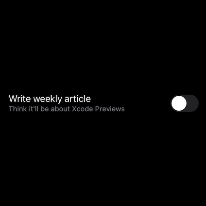
title: "Write weekly article",
description: "Think it'll be about Xcode Previews",
isCompleted: .constant(false)
)
}
}However, as alluded to above, constant bindings do have quite strict limits, and they’ll often prevent us from interacting with our UI as we’re previewing it. For example, even if we tap our above Toggle, its isCompleted value will always remain constant, which makes our view seem broken.
One way to fix that problem would be to instead introduce a custom Binding API for creating fully dynamic mocks — for example by capturing a given value within a pair of getter and setter closures, like this:
extension Binding {
    static func mock(_ value: Value) -> Self {
        var value = value
        return Binding(get: { value }, set: { value = $0 })
    }
}
With the above in place, we can now go back to our ReminderRowPreview implementation and make it fully interactive — simply by replacing .constant with .mock:
struct ReminderRowPreview: PreviewProvider {
static var previews: some View {
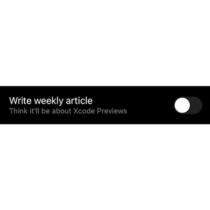
ReminderRow(
title: "Write weekly article",
description: "Think it'll be about Xcode Previews",
isCompleted: .mock(false)
)
}
}The beauty of the fact that Xcode previews are declared using normal Swift code is that it lets us write our own utilities and abstractions, that in turn can let us use previews in much more powerful ways. But that’s just the beginning.
Specific environments
Next, let’s take a look at how modifying a component’s surrounding environment can let us preview how it’ll behave under various simulated conditions.
To get started, let’s use the built-in .colorScheme view modifier to preview what our ReminderRow will look like when rendered on a device that’s running in dark mode — like this:
struct ReminderRowPreview: PreviewProvider {
    static var previews: some View {
        ReminderRow(
            title: "Write weekly article",
            description: "Think it'll be about Xcode Previews",
            isCompleted: .mock(false)
        )
        .colorScheme(.dark)
    }
}
While the above preview setup will render our component itself in dark mode, its surroundings will still remain in light mode, which (given that our view doesn’t have a background color) gives us white text rendered on a white background. Not great.
Tip: you can use the above PREVIEW button to see the result of that code block. A preview of a preview, if you will. Very meta.
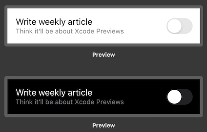
Now, there are two main ways to solve the above problem. One way is to embed our ReminderRow component in a platform-provided container, such as a NavigationView, before previewing it. If we do that, while also hiding that container view’s navigation bar, then our component will still be rendered using the same layout as before — but now in full dark mode:
struct ReminderRowPreview: PreviewProvider {
    static var previews: some View {
        NavigationView {
            ReminderRow(
                title: "Write weekly article",
                description: "Think it'll be about Xcode Previews",
                isCompleted: .mock(false)
            )
            .navigationBarTitle("")
            .navigationBarHidden(true)
        }
        .colorScheme(.dark)
    }
}
Another variant of the above approach would be to use a TabView instead, and then hide its tab bar in a similar fashion.
The other way, which doesn’t involve adding any form of navigation stack, would be to give our component an explicit background color — and if we use the systemBackground API on UIColor, then we can mimmic what our component will look like when displayed in dark mode (even if its environment will still remain in light mode):
struct ReminderRowPreview: PreviewProvider {
    static var previews: some View {
        ReminderRow(
            title: "Write weekly article",
            description: "Think it'll be about Xcode Previews",
            isCompleted: .mock(false)
        )
        .background(Color(UIColor.systemBackground))
        .colorScheme(.dark)
    }
}
However, what color scheme that our previews will be rendered using is just one of many different environment parameters that we can tweak. For example, we can also tell SwiftUI to preview our component using a given size category (which is what the system’s dynamic type settings translate into), and even control what device that the preview will be rendered on:
struct ReminderRowPreview: PreviewProvider {
    static var previews: some View {
        ReminderRow(
            title: "Write weekly article",
            description: "Think it'll be about Xcode Previews",
            isCompleted: .mock(false)
        )
        .previewDevice("iPhone 11")
        .environment(\.sizeCategory, .accessibilityExtraExtraExtraLarge)
    }
}
No, the above ExtraExtraExtra name is not a typo, that’s actually what the real API is called, believe it or not.
So Xcode’s preview system can be tweaked and adjusted in many different ways — which either lets us set up a specific environment for each component, or even create multiple simultaneous ones.
Group, iterations, and convenience APIs
Just like standard SwiftUI views, multiple preview views can be grouped into a single container using the Group API. However, within Xcode’s Preview feature, such groups are treated in a special way, as the system will create a separate preview for each group member — which in turn enables us to easily preview multiple view configurations at the same time.
For example, here’s how we could quickly preview what our ReminderRow will look like when rendered in both light and dark mode, using a single PreviewProvider:
struct ReminderRowPreview: PreviewProvider {
    static var previews: some View {
        let row = ReminderRow(
            title: "Write weekly article",
            description: "Think it'll be about Xcode Previews",
            isCompleted: .mock(false)
        )
        .previewLayout(.sizeThatFits)

        return Group {
            row

            row.background(Color(UIColor.systemBackground))
               .colorScheme(.dark)
        }
    }
}
Note how we’re using the .previewLayout modifier above to tell Xcode to render our previews without any “device chrome”, and instead just display each component configuration as a stand-alone view.
While the above approach is really convenient when we just want to preview a small number of permutations — if we want to combine multiple environment modifiers in order to preview more layout variants, then writing the above kind of code each time can start to become a bit tedious.
But again, we’re working with normal Swift code here, so just like whenever we discover a repetitive source of boilerplate within our production code, we can build our own custom abstractions on top of the preview system — to help us generate a large number of previews with very little effort.
But before we get started, we’re going to need a few small extensions that’ll help us label each of the previews that we’re about to generate. In this case, we’re going to combine each possible ColorScheme (that is, currently, light and dark mode) with the smallest and largest ContentSizeCategory values — so let’s write the following pair of extensions for generating preview-specific names for those types, like this:
extension ColorScheme {
    var previewName: String {
        String(describing: self).capitalized
    }
}

extension ContentSizeCategory {
    static let smallestAndLargest = [allCases.first!, allCases.last!]

    var previewName: String {
        self == Self.smallestAndLargest.first ? "Small" : "Large"
    }
}
Next, let’s borrow the following ForEach extension from “Using SwiftUI’s ForEach with raw values”, which’ll let us more easily loop over an array of values within our SwiftUI code:
extension ForEach where Data.Element: Hashable, ID == Data.Element, Content: View {
init(values: Data, content: @escaping (Data.Element) -> Content) {
self.init(values, id: \.self, content: content)
}
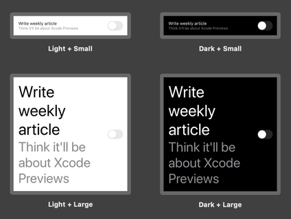
}With the above pieces in place, we can now start building our custom abstractions for generating multiple previews. First, let’s create one for previewing individual components — by implementing a wrapper View that iterates over each possible ColorScheme, as well as the ContentSizeCategory array we defined above, and sets up each preview accordingly:
struct ComponentPreview<Component: View>: View {
    var component: Component

    var body: some View {
        ForEach(values: ColorScheme.allCases) { scheme in
            ForEach(values: ContentSizeCategory.smallestAndLargest) { category in
                self.component
                    .previewLayout(.sizeThatFits)
                    .background(Color(UIColor.systemBackground))
                    .colorScheme(scheme)
                    .environment(\.sizeCategory, category)
                    .previewDisplayName(
                        "\(scheme.previewName) + \(category.previewName)"
                    )
            }
        }
    }
}
Note that ForEach has the same effect as Group within previews, in that using it generates a separate preview for each value that is being iterated over.
While the above type is ready to be used as-is, let’s also create a convenience API that’ll let us easily generate a component preview for any View within our code base:
extension View {
    func previewAsComponent() -> some View {
        ComponentPreview(component: self)
    }
}
With that done, we can now go back to our ReminderRowPreview from before and easily make it generate four different previews, simply by calling our new previewAsComponent API on our component:
struct ReminderRowPreview: PreviewProvider {
    static var previews: some View {
        ReminderRow(
            title: "Write weekly article",
            description: "Think it'll be about Xcode Previews",
            isCompleted: .mock(false)
        )
        .previewAsComponent()
    }
}
Next, let’s implement a similar abstraction for previewing complete screens, rather than individual components. While we were primarily interested in seeing how a given component behaves when rendered using different color schemes and content size categories — when previewing a whole screen, we might instead want to see how it gets rendered on multiple devices. That way, we’ll be able to get a more wholistic view of our UI, especially if we also combine that list of devices with all possible ColorScheme variants as well — like this:
struct ScreenPreview<Screen: View>: View {
    var screen: Screen

    var body: some View {
        ForEach(values: deviceNames) { device in
            ForEach(values: ColorScheme.allCases) { scheme in
                NavigationView {
                    self.screen
                        .navigationBarTitle("")
                        .navigationBarHidden(true)
                }
                .previewDevice(PreviewDevice(rawValue: device))
                .colorScheme(scheme)
                .previewDisplayName("\(scheme.previewName): \(device)")
                .navigationViewStyle(StackNavigationViewStyle())
            }
        }
    }

    private var deviceNames: [String] {
        [
            "iPhone 8",
            "iPhone 11",
            "iPhone 11 Pro Max",
            "iPad (7th generation)",
            "iPad Pro (12.9-inch) (4th generation)"
        ]
    }
}

extension View {
    func previewAsScreen() -> some View {
        ScreenPreview(screen: self)
    }
}
Note how the above list of deviceNames need to exactly match the names that appear in Xcode’s device selector, otherwise the preview system will throw an error.
With the above abstractions in place, we can now easily generate either a compact or full-screen preview for any of our views with just a single method call — with in turn lets us iterate on our UI code while instantly seeing how it’ll get rendered within multiple kinds of environments. Really cool!
Previews are not just for SwiftUI views
Finally, let’s take a look at how we can even use Xcode’s Previews feature to iterate on views that are not built using SwiftUI — but rather using any of Apple’s older UI frameworks, such as UIKit, Core Animation, or AppKit.
Since each preview is defined as a SwiftUI view, and since there are a built-in backward compatible APIs that let us bring any UIView or UIViewController (or their AppKit equivalents) into the world of SwiftUI — we can connect those two things to make the preview system even more flexible.
One way to make that happen would be to create specific bridging types for individual views or view controllers — for example like this:
@available(iOS 13, *)
struct SchedulingView: UIViewControllerRepresentable {
    var schedule: Schedule

    func makeUIViewController(context: Context) -> SchedulingViewController {
        SchedulingViewController(schedule: schedule)
    }

    func updateUIViewController(_ uiViewController: SchedulingViewController,
                                context: Context) {
        // We don’t need to write any update code in this case.
    }
}

@available(iOS 13, *)
struct SchedulingViewPreview: PreviewProvider {
    static var previews: some View {
        SchedulingView(schedule: Schedule())
    }
}
Note how both of the above types are marked as iOS 13-only, using Swift’s @available attribute. While that’s not required for apps that have iOS 13 as their minimum deployment target, many apps that were written using UIKit or AppKit still need to support older versions of Apple’s operating systems.
While the above works perfectly fine for previewing a single view controller, having to write a dedicated wrapper type each time that we want to create a new preview can again become a source of boilerplate and friction. So let’s create one more abstraction — this time to enable any UIViewController to easily be turned into a SwiftUI preview, like this:
extension UIViewController {
    @available(iOS 13, *)
    private struct Preview: UIViewControllerRepresentable {
        var viewController: UIViewController

        func makeUIViewController(context: Context) -> UIViewController {
            viewController
        }

        func updateUIViewController(_ uiViewController: UIViewController,
                                    context: Context) {
            // No-op
        }
    }

    @available(iOS 13, *)
    func asPreview() -> some View {
        Preview(viewController: self)
    }
}
With the above in place, we can now easily make any of our view controllers compatible with Xcode Previews. All that we have to do is to create a thin PreviewProvider that calls our new asPreview method on the view controller that we wish to preview:
@available(iOS 13, *)
struct SchedulingViewPreview: PreviewProvider {
    static var previews: some View {
        SchedulingViewController(schedule: Schedule()).asPreview()
    }
}
In general, defining lightweight abstractions through small wrappers and extensions can often be a great way to improve a team’s overall productivity. Especially when it comes to things like UI previews, and other kinds of tooling, we’d ideally like to reduce the amount of friction and setup required to the absolute minimum — so that we can spend less time configuring our tools, and more time building fantastic UIs.
Swift by Sundell is brought to you by the Genius Scan SDK — Add a powerful document scanner to any mobile app, and turn scans into high-quality PDFs with one line of code. Try it today.
Conclusion
Whether you’ve been using Xcode Previews since the first beta of Xcode 11, or whether they’re completely new to you, I hope that this article has showed you at least one new way of using them. Of course, there are several other ways that these previews can be used, and I’m sure that Apple will introduce even more previewing capabilities at WWDC20, which (at the time of writing) kicks off in just a few weeks.
Reducing iteration cycle times can really be a big productivity booster, and that’s something that Xcode Previews can definitely help us achieve — by turning time consuming “Build and run” cycles into almost instant updates. They’re not perfect, and can (just like Xcode itself) sometimes be a bit unstable, but — at least if you ask me — they’re a big leap forward for UIKit, AppKit and SwiftUI-based UI development.
What do you think? Do you enjoy using Xcode’s Preview feature? Let me know — along with your questions, comments and feedback — either via Twitter or email.
Thanks for reading! 🚀