
This article has been archived, as it was published several years ago, so some of its information might now be outdated. For more recent articles, please visit the main article feed.
Encapsulating SwiftUI view styles
Discover page available: SwiftUIRegardless of what framework or tool that’s used to build a given UI, finding a good way to separate the structure and internal logic of our various views from the styles that are being applied to them is often key in order to make UI code easier to maintain and manage.
While certain technologies offer a quite natural way of separating those two aspects of UI development, such as how websites declare their structure through HTML and their styles using CSS — when it comes to SwiftUI, it might not initially seem like that kind of separation is practical, or even encouraged.
However, if we start exploring SwiftUI’s various APIs and conventions a bit further, it turns out that there are a number of tools and techniques that we can use to create a clean separation between our view hierarchy, its styles, and the components that we’re looking to reuse across a given project.
That’s exactly what we’ll take a look at in this week’s article.

Swift by Sundell is brought to you by the Genius Scan SDK — Add a powerful document scanner to any mobile app, and turn scans into high-quality PDFs with one line of code. Try it today.
Reusable components
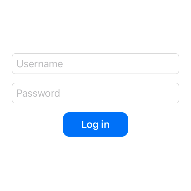
As an example, let’s say that we’re currently working on a LoginView that lets our users enter their username and password in order to log into our app. For those two text fields we’re using the system-provided “round border” style, and for the button that performs the actual login action we’ve applied a series of modifiers to give it a custom look:
struct LoginView: View {
    var handler: (LoginCredentials) -> Void
    @State private var username = ""
    @State private var password = ""

    var body: some View {
        VStack(spacing: 15) {
            TextField("Username", text: $username)
                .textFieldStyle(RoundedBorderTextFieldStyle())
            SecureField("Password", text: $password)
                .textFieldStyle(RoundedBorderTextFieldStyle())
            Button("Log in") {
                handler(LoginCredentials(
                    username: username,
                    password: password
                ))
            }
            .foregroundColor(.white)
            .font(Font.body.bold())
            .padding(10)
            .padding(.horizontal, 20)
            .background(Color.blue)
            .cornerRadius(10)
        }
    }
}
💡 Tip: You can use the PREVIEW button within the above code sample to see what it looks like when rendered.
While that setup works perfectly fine as long as the above button is only displayed within that particular view, if we instead wanted to reuse that button style across our app, we’d currently have to manually apply that same set of modifiers in each place — which would both be repetitive, and likely lead to a ton of inconsistencies over time — so let’s instead turn those styles into a reusable component that we can just insert whenever needed.
One way to do that would be to extract the above Button view, along with the modifiers that we apply to it, into a new View implementation — like this:
struct ActionButton: View {
    var title: String
    var action: () -> Void

    var body: some View {
        Button(title, action: action)
            .foregroundColor(.white)
            .font(Font.body.bold())
            .padding(10)
            .padding(.horizontal, 20)
            .background(Color.blue)
            .cornerRadius(10)
    }
}
However, while implementing reusable components as custom View types is certainly a common and incredibly useful pattern, it does give us a few downsides in cases like this.
First of all, since we’re now wrapping our Button within a new, separate ActionButton type, we have to replicate all of the Button APIs that we want our new view to support. For instance, we’ve already had to replicate the title and action properties that Button gives us for free.
If we then wanted to mimmic the exact initializer that we previously used when creating the button within our LoginView, we’d have to extend our new ActionButton type with a custom initializer that removes the external parameter label for the title property. We can also no longer use Button-specific modifiers directly on instances of our new type, and we can no longer pass those instances to any API that accepts Button arguments.
One way to solve those issues would be to extend the built-in Button type, rather than wrapping it — for example by implementing a modifier-like method that applies our custom styles to any button instance:
extension Button {
    func withActionButtonStyles() -> some View {
        self.foregroundColor(.white)
            .font(Font.body.bold())
            .padding(10)
            .padding(.horizontal, 20)
            .background(Color.blue)
            .cornerRadius(10)
    }
}
With the above in place, we can now style our login button from before by simply calling our new method on it — like this:
struct LoginView: View {
    ...

    var body: some View {
        VStack(spacing: 15) {
            ...
            Button("Log in") {
                handler(LoginCredentials(
                    username: username,
                    password: password
                ))
            }
            .withActionButtonStyles()
        }
    }
}
Although modeling shared view styles using extensions could potentially make discovering those styles slightly more difficult compared to when using separate View types, doing so gives us so much more flexibility, and creates a neat separation between our actual views and the styles that are being applied to them.
Dedicated style types
One way to address that discoverability aspect, while still giving our styles extension-like characteristics, would be to embrace the pattern that SwiftUI itself uses for many of its own, built-in styles — dedicated style types.
Most built-in SwiftUI controls come with a companion protocol that can be used to implement reusable style configurations for that particular control. We actually have already been using that convention within our LoginView, when styling our two text fields using RoundedBorderTextFieldStyle, and it turns out that we can also use that system to create our own custom styles as well.
For example, the ButtonStyle protocol enables us to do just that for our custom action button styles:
struct ActionButtonStyle: ButtonStyle {
    func makeBody(configuration: Configuration) -> some View {
        configuration.label
            .foregroundColor(.white)
            .font(Font.body.bold())
            .padding(10)
            .padding(.horizontal, 20)
            .background(Color.blue)
            .cornerRadius(10)
    }
}
With the above in place, we can once again easily apply our custom set of styles to any Button — only now we’ll do it using the built-in buttonStyle modifier, combined with an instance of our new ActionButtonStyle type:
struct LoginView: View {
    ...

    var body: some View {
        VStack(spacing: 15) {
            ...
            Button("Log in") {
                handler(LoginCredentials(
                    username: username,
                    password: password
                ))
            }
            .buttonStyle(ActionButtonStyle())
        }
    }
}
However, just like with all things programming, there are always trade-offs. Although the above technique lets us neatly encapsulate our styles within a specific type, while also giving us the flexibility to apply those styles to any Button — since we’re now using a completely custom ButtonStyle, the system will no longer apply any default styles or behaviors to the above button. For example, our button will no longer automatically react to taps by making its title brighter, which might make it seem less responsive to user interactions.
Thankfully, that problem can be fixed quite easily. All that we have to do is to use the Configuration object that gets passed into our custom ButtonStyle to check if the button is currently being pressed, and to then modify our styles accordingly — for example like this:
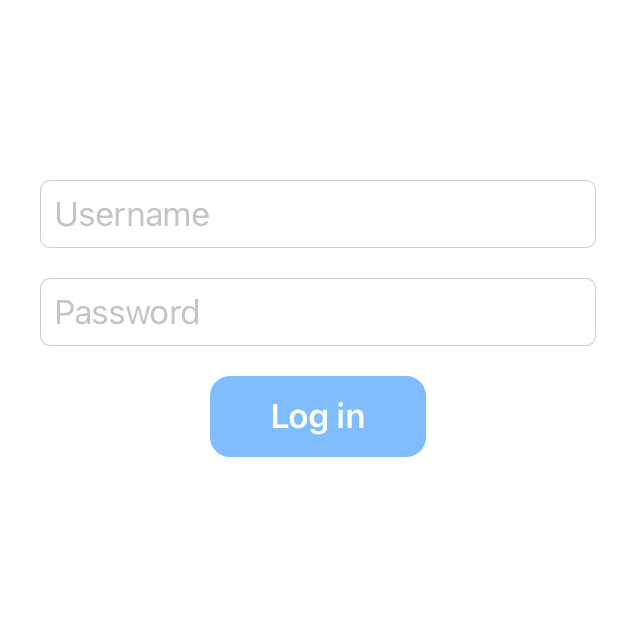
struct ActionButtonStyle: ButtonStyle {
    func makeBody(configuration: Configuration) -> some View {
        configuration.label
            .foregroundColor(.white)
            .font(Font.body.bold())
            .padding(10)
            .padding(.horizontal, 20)
            .background(Color.blue.opacity(
                configuration.isPressed ? 0.5 : 1
            ))
            .cornerRadius(10)
    }
}
The system will still automatically apply animations when transitioning between our button’s pressed and default states, so with the above change in place, our button now looks just as responsive and native as it initially did — really nice.
Besides all of the encapsulation aspects, one major advantage of implementing our shared view styles using SwiftUI’s various style protocols is that we can apply them to an entire view hierarchy at once. For example, let’s say that we wanted to add a second button to our LoginView that lets our users reset their passwords — we could now give both of those buttons the same styles by applying our ActionButtonStyle directly to our view’s root VStack:
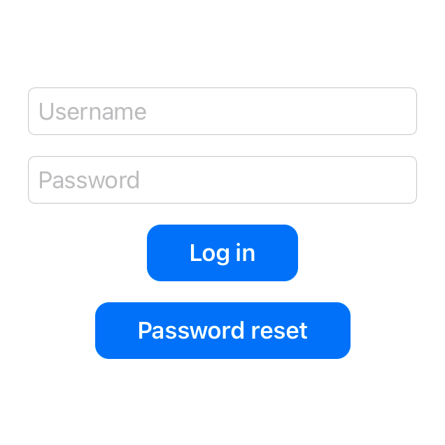
struct LoginView: View {
    enum Action {
        case login(LoginCredentials)
        case resetPassword
    }

    var handler: (Action) -> Void
    @State private var username = ""
    @State private var password = ""

    var body: some View {
        VStack(spacing: 15) {
            TextField("Username", text: $username)
            SecureField("Password", text: $password)
            Button("Log in") {
                handler(.login(LoginCredentials(
                    username: username,
                    password: password
                )))
            }
            Button("Password reset") {
                handler(.resetPassword)
            }
        }
        .textFieldStyle(RoundedBorderTextFieldStyle())
        .buttonStyle(ActionButtonStyle())
    }
}
Note that we’re now also applying the styles for our two text fields by modifying our root VStack, and that same pattern can be used to configure any SwiftUI control that supports type-based styling.
Variants and overrides
While being able to configure multiple views with the same set of styles is incredibly powerful and convenient, chances are that we’ll also occasionally want to tweak some of those styles on a per-view basis.
For example, the two buttons within our LoginView currently have the exact same look, which also gives them the same amount of prominence within our UI — something that we might not want in this case, considering that our password reset action should probably be considered secondary to the action of logging in.
Now there are multiple ways that we can address that issue — including by adding various parameters to our ActionButtonStyle type, or by applying a different set of modifiers to our reset password button — but perhaps the simplest way to deal with common variations like this would be to create additional style implementations to match them.
Here’s how we could do just that for all of the secondary buttons within our app:
struct SecondaryButtonStyle: ButtonStyle {
    func makeBody(configuration: Configuration) -> some View {
        // Our secondary style uses less horizontal padding and
        // a gray background color, rather than a blue one:
        configuration.label
            .foregroundColor(.white)
            .font(Font.caption.bold())
            .padding(10)
            .background(
                Color.gray.opacity(configuration.isPressed ? 0.5 : 1)
            )
            .cornerRadius(10)
    }
}
If we then rename our ActionButtonStyle type from before to PrimaryButtonStyle, we could now either style our two buttons separately, or we could do the following — and apply our default, primary style to our view hierarchy as a whole, while also overriding the ButtonStyle used for our password reset button specifically, like this:
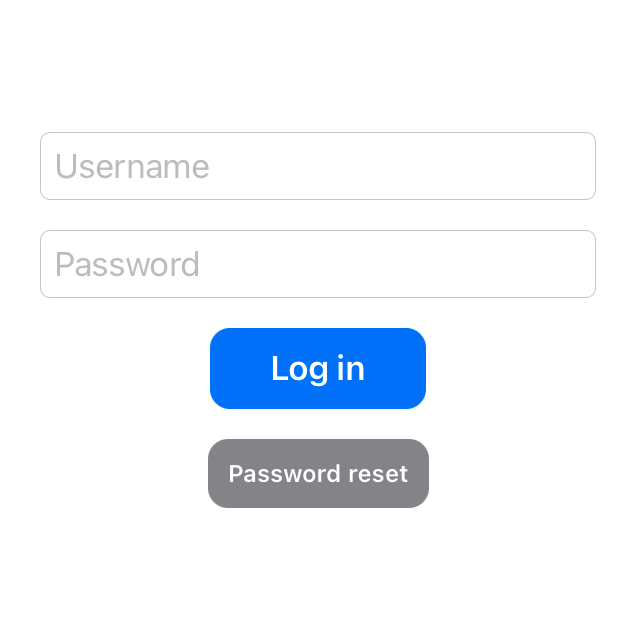
struct LoginView: View {
    ...

    var body: some View {
        VStack(spacing: 15) {
            Button("Log in") {
                handler(.login(LoginCredentials(
                    username: username,
                    password: password
                )))
            }
            Button("Password reset") {
                handler(.resetPassword)
            }
            .buttonStyle(SecondaryButtonStyle())
        }
        .textFieldStyle(RoundedBorderTextFieldStyle())
        .buttonStyle(PrimaryButtonStyle())
    }
}
That’s another thing that makes SwiftUI’s styling system so powerful — in that we can always override any particular style for a specific part of our view hierarchy, while still assigning our most common set of styles as defaults.
However, while implementing each of our various styles as separate types often lets us keep our code simple and free of complex conditions, doing so can also lead to a fair amount of code duplication. While it could definitely be argued that in the above case, the duplication between our PrimaryButtonStyle and SecondaryButtonStyle is so insignificant that we can simply ignore it, let’s also take a look at how we could share certain common configurations between those two types.
One way to do that would be to implement them both within the same file, and to then extend the styling protocol that they both conform to — ButtonStyle in this case — with the properties that we’re looking to share between the two:
private extension ButtonStyle {
    var foregroundColor: Color { .white }
    var padding: CGFloat { 10 }
    var cornerRadius: CGFloat { 10 }
    var pressedColorOpacity: Double { 0.5 }
}
We could then simply reference the above properties when applying those shared styles, rather than hard-coding those values within each implementation:
struct PrimaryButtonStyle: ButtonStyle {
    func makeBody(configuration: Configuration) -> some View {
        configuration.label
            .foregroundColor(foregroundColor)
            .font(Font.body.bold())
            .padding(padding)
            .padding(.horizontal, 20)
            .background(Color.blue.opacity(
                configuration.isPressed ? pressedColorOpacity : 1
            ))
            .cornerRadius(cornerRadius)
    }
}

struct SecondaryButtonStyle: ButtonStyle {
    func makeBody(configuration: Configuration) -> some View {
        configuration.label
            .foregroundColor(foregroundColor)
            .font(Font.caption.bold())
            .padding(padding)
            .background(Color.gray.opacity(
                configuration.isPressed ? pressedColorOpacity : 1
            ))
            .cornerRadius(cornerRadius)
    }
}
There are of course a number of other ways that the above kind of code sharing could be accomplished — including by extending types like Font and Color directly, or by implementing other dedicated types for those shared styles (for example some form of AppTheme struct). Or, we could simply choose to ignore that source of code duplication entirely if we don’t think that it’ll be an issue within our particular project.
A common pattern within SwiftUI
Just like how we’ve now used dedicated style types to configure both buttons and text fields, we can use that same pattern with a number of different SwiftUI views — including toggles, pickers, lists, progress views, labels, and many more.
As a final example, here’s how we could create a custom LabelStyle that renders a given label’s icon and title vertically, rather than horizontally (which is the default):
struct VerticalLabelStyle: LabelStyle {
    func makeBody(configuration: Configuration) -> some View {
        VStack {
            configuration.icon
            configuration.title
        }
    }
}
Just like our other styles from before, our new VerticalLabelStyle can now be applied to a series of labels all at once — and in case we don’t wish to place them within any particular layout stack, we could always use a Group, like this:
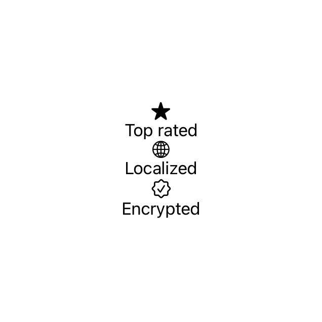
Group {
    Label("Top rated", systemImage: "star.fill")
    Label("Localized", systemImage: "globe")
    Label("Encrypted", systemImage: "checkmark.seal")
}
.labelStyle(VerticalLabelStyle())
So since using various implementations of a shared styling protocol is such a common pattern within the world of SwiftUI, it’s often a great option for encapsulating our own custom styles as well.
Swift by Sundell is brought to you by the Genius Scan SDK — Add a powerful document scanner to any mobile app, and turn scans into high-quality PDFs with one line of code. Try it today.
Conclusion
The fact that SwiftUI was very much designed around the idea of composition often gives us several different options when it comes to how we want to accomplish a given task. In the case of view styling in particular, we can choose to build a brand new View type for each component or style, we can use modifiers and extensions, or we can use custom implementations of SwiftUI’s various styling protocols — and we can pick the best fit among those options within each given situation.
Hopefully this article has given you an overview of those options and their various pros and cons. If you have any questions, comments, or feedback — feel free to reach out via either Twitter or email.
Thanks for reading! 🚀